CHALLENGE
Create a brand identity—including a new name—for an established architecture firm more traditionally named after its owners but with a desire for a brand that embodies its team approach.
SOLUTION
KINETIK led the McGraw Bagnoli team through a multiple-phase discovery and strategic process to assess their current brand, determine if renaming was needed or even in the firm’s best interests, and evaluate the opinions and perceptions of peers, clients and the entire staff itself.
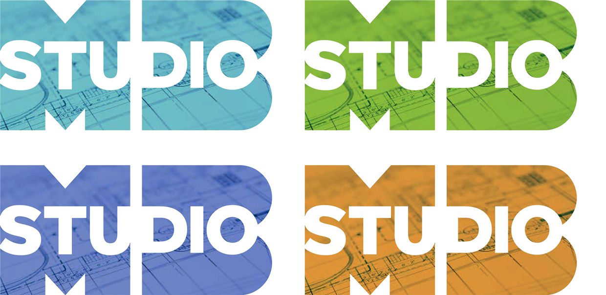
Out of this process, the name StudioMB was born to reflect the spirit of a company that is collaborative, collective and a true partnership of many without completely abandoning the brand equity established through the names of the founding partners.
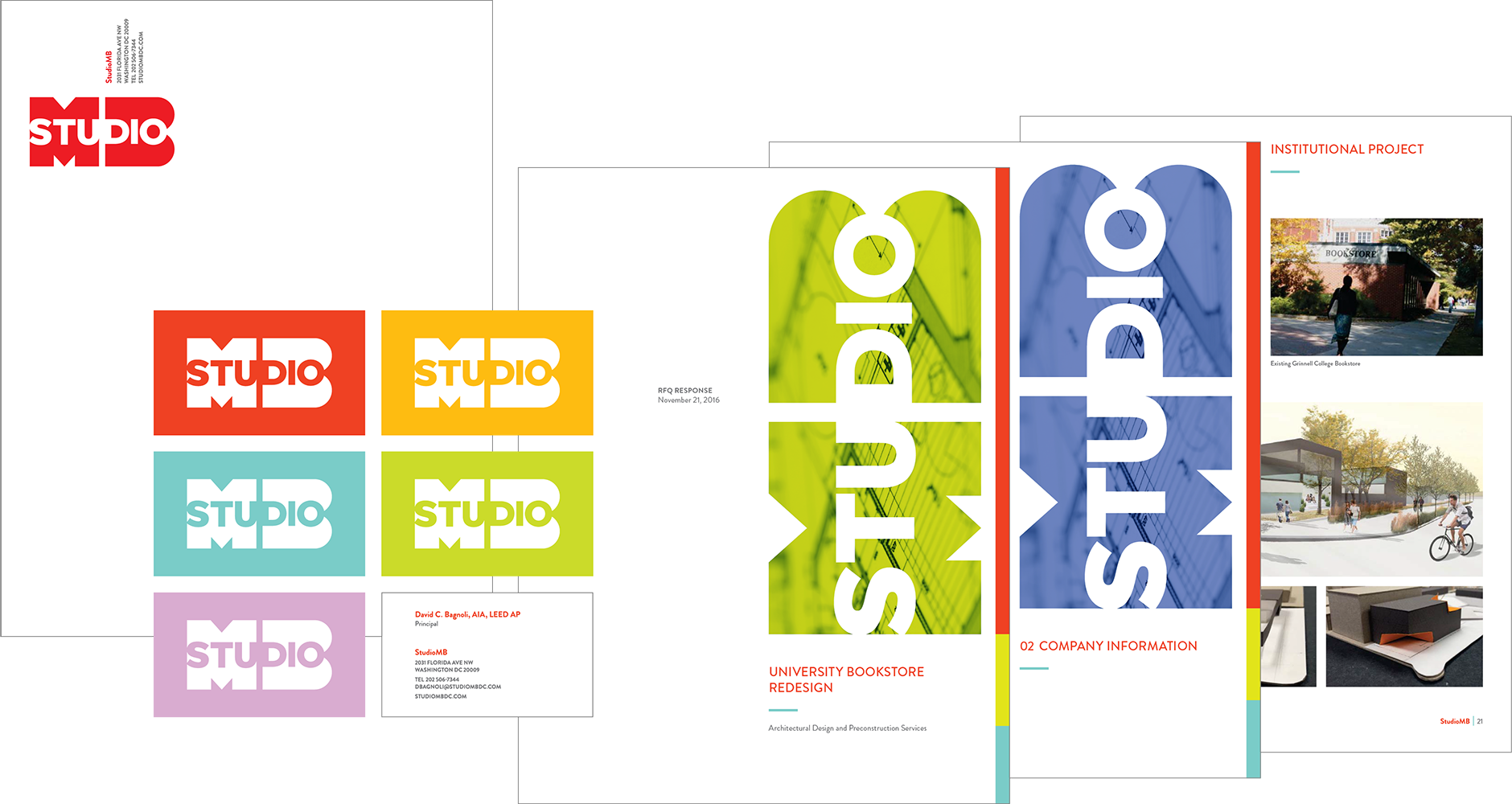
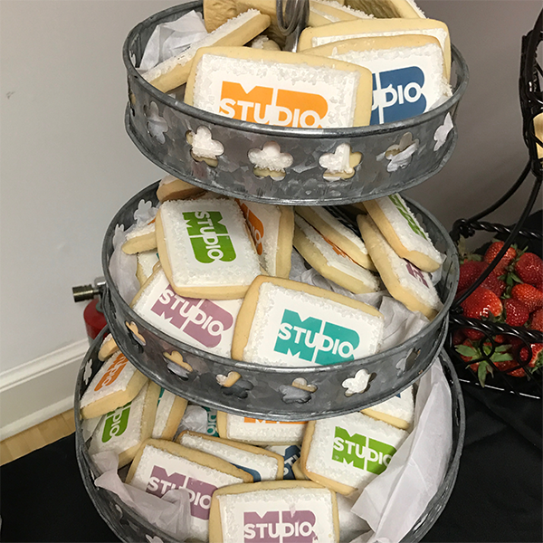
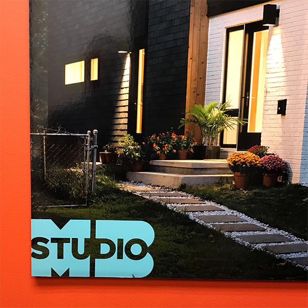
The logomark transforms the simplified letterforms “MB” into shapes that become objects themselves. The integration of “studio” into the letterforms signifies the prominence of the staff as a whole, along with the founding partners.
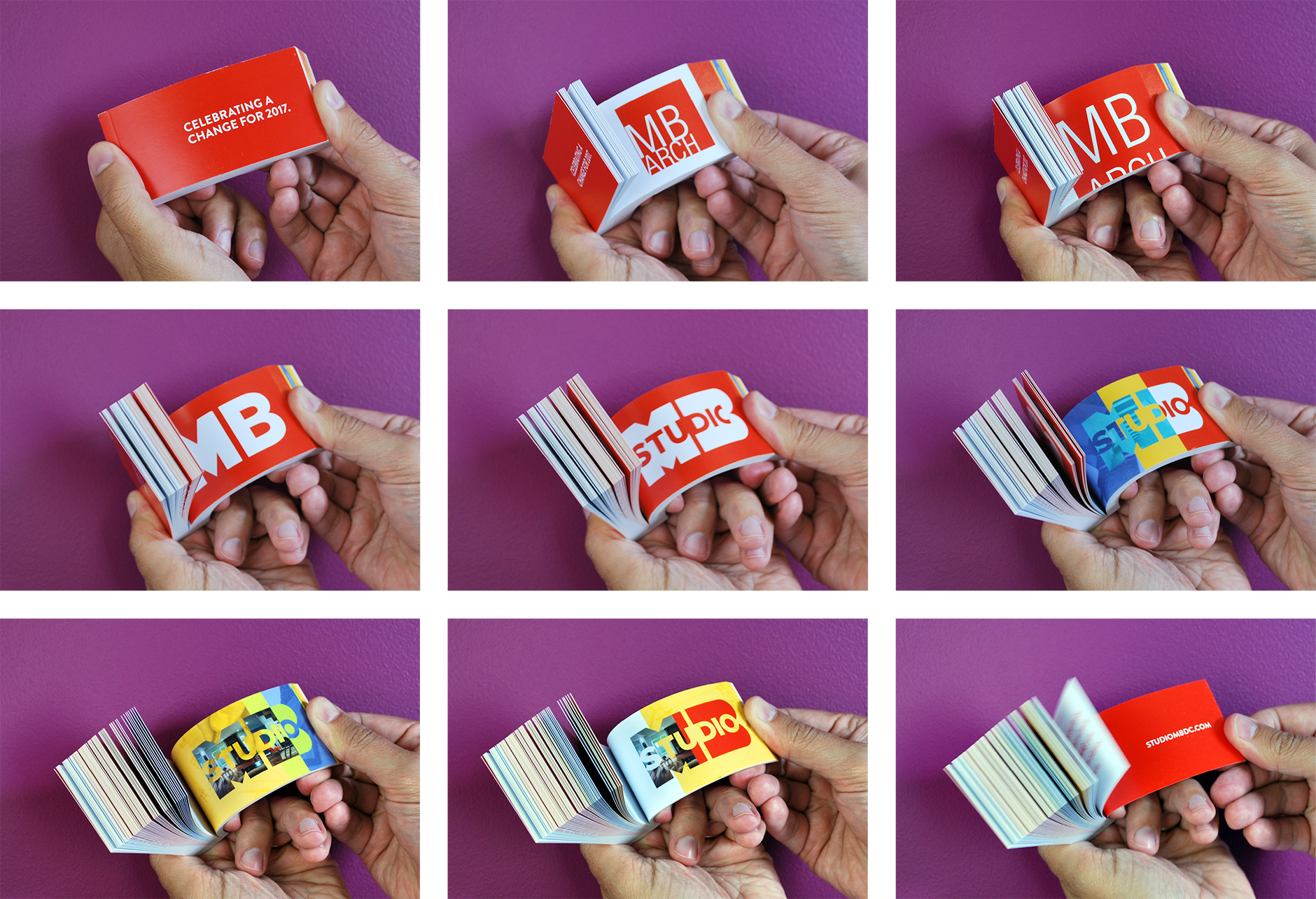
KINETIK created an entire suite of identity collateral as well as promotional materials for the launch of the new identity including an online animation and a flipbook invitation to the firm’s annual party that announced the transition to StudioMB.
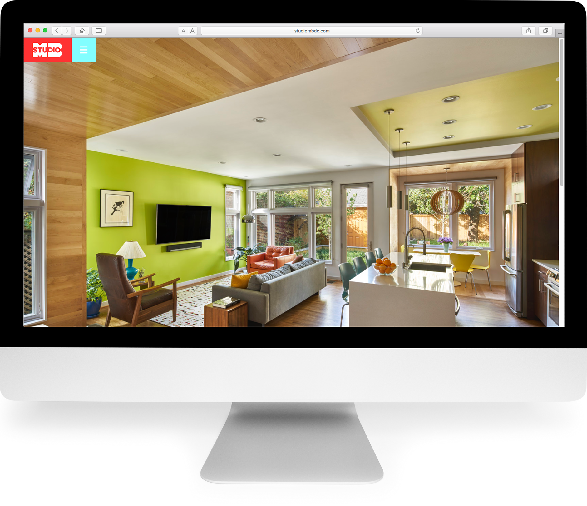
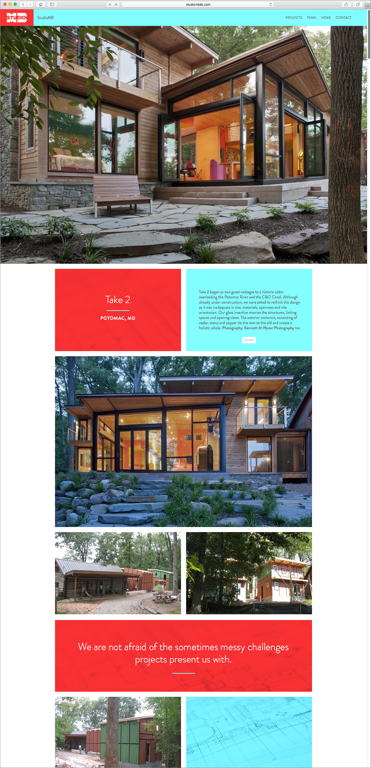
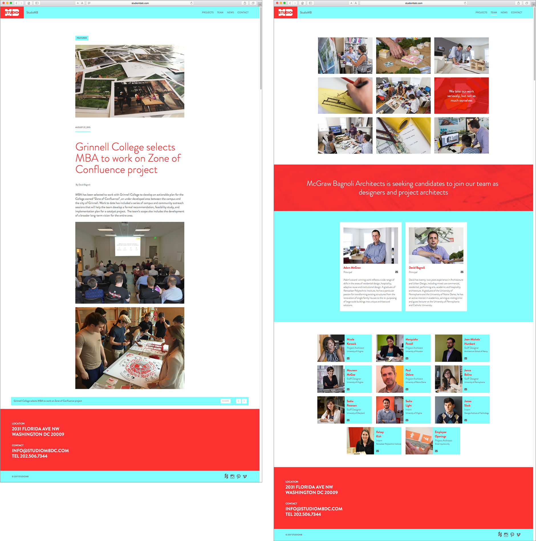
A completely new website was created to exhibit the essence of the firm’s past work and current projects while being strategically structured to feature future growth. Armed with a comprehensive strategic plan developed in an initial research phase, KINETIK designed and built a custom WordPress site that focuses on StudioMB’s portfolio while highlighting the firm’s culture and personality.
Full-screen images of the firm’s work, process, and people interspersed with quotes about the firm’s beliefs introduce the studio with high impact visuals that also tell a story. Images of StudioMB team members along with content that is friendly and approachable differentiate the firm’s online presence from typical portfolio-centric websites.
The bright red was chosen to remain consistent with the brand equity established in StudioMB’s original identity, with blue as a highlight accent. A retractable navigation allows for full impact of the incredible architecture images. In keeping with the desire to be approachable, intuitive navigation allows users to delve into a project’s specifics with multiple ways to access other parts of the site and the main nav always in view.
Updating and managing content internally was a critical component of the new site’s goals. StudioMB team members are able to quickly add visual and editorial content, while featuring news updates on completed projects and those in progress keeps the site fresh and alive.
